|
When I went to begin my logo design I felt very overwhelmed, as graphic design and logo creation is not something I have a lot of knowledge about. I clicked on a few different design websites, but wasn’t really happy until I found Canva.  Speaking of which, their logo is pretty beautiful. I enjoyed using Canva because it was user friendly, and free. They do have additional purchase options, but it is definitely possible to use only free features and still create a nice looking logo. I began clicking and dragging and changing colors, sizes, fonts and location of the items. I came up with 3 draft options in about an hour. I think that I will end up modifying them quite a bit from here, but I have some ideas now and feel way less overwhelmed. I plan to add color, but currently my drafts are all black and white because I couldn’t decide on a scheme, and I wanted to see how they would look regardless of color. Here are my first attempts at creating a logo: 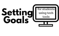 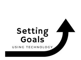 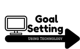 Overall, I was pleasantly surprised with how quickly and easily a logo could actually be created. The variety of what you can do with a logo is a bit overwhelming, but after this first try I am feeling confident that I will be able to come up with a logo that I like for my capstone website that represents the goal setting strategies I want to share with other teachers.
3 Comments
Kayla, you followed the correct steps! which is start by making the logo in black and white first! I also liked Canva but only when I did my info graphic for tech safety, I couldn't work with it in making the logo, perhaps I was tired and frustrated by then? I am sure we will all end up changing and tweaking our logos as the weeks go on. I like your middle logo the best, because when I see it, the arrow makes me think of and increase in "achievement".
Heather Feinberg
6/5/2018 09:27:51 pm
Kayla, I love your logos! Even in black and white they go straight to the point. I started in black and white and need to go back to make more adjustments. Making a logo sounded easy and then it took me over an hour!
Benjamin Scinto
6/13/2018 07:59:29 pm
Thanks for reminding me about Canva, I forgot about that one. An, Jeff and I used it for our Pictogram or something like that and I remember it being quite user friendly. Of your created logos, my favorite was the middle one, the upward arrow better demonstrates goal setting and the using technology font is sleek, matching the modernism of tech. In the other two, the monitor makes it look antiquated Leave a Reply. |
AuthorKayla Bryant is an elementary school teacher in Napa, CA. This year she teaches a 2/3 combo class. She keeps a journal with funny quotes from her students, and enjoys learning and laughing alongside them. Some of her main educational interests are related to goal setting, growth mindset, and creativity. Archives
July 2018
Categories |
 RSS Feed
